
Website design: discovery and editorial structure
These two projects explore different visitor tasks. HMB Estates emphasizes property discovery and enquiries. True Skin Secrets uses an editorial homepage to introduce beauty content. They are supporting design work; neither is presented as a measured SEO-growth case study.
HMB Estates: start with the browsing decision
Scope: self-initiated concept. Anchor: hmb-estates.
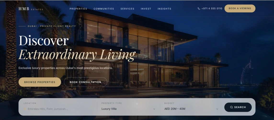
The concept opens with a large property image and two paths: browse properties or arrange a consultation. Location, property type and budget controls then translate a broad interest into more specific browsing choices. The visual system uses a dark background, restrained gold accents and a quieter typographic hierarchy appropriate to the intended property setting.
The strongest aspect of the concept is the connection between the initial impression and the next decision. Property browsing is visible near the introduction rather than being buried beneath a long agency story. Consultation provides an alternative for someone who is not ready to specify a property search.
The supplied design extends into listing cards, services, community information and contact areas. These elements should support the browsing task rather than compete with it. On a production site, the hierarchy would need to be tested with real inventory and representative users: which filters matter, which fields are essential and what a useful empty result looks like.
| Interface question | Proposed production check |
|---|---|
| Do the controls match actual inventory? | Verify supported locations, property types and price ranges |
| Can a visitor compare listings? | Use consistent fields and genuine availability information |
| Does the enquiry carry useful context? | Include the selected property or search criteria where appropriate |
| Does the experience work on a phone? | Test controls, labels, images and results at small widths |
These are proposed checks, not completed usability findings. The source documents conflict about the implementation platform and contain a WordPress production plan alongside concept material. This collection therefore concentrates on the design evidence. Mockup property details, business statistics, testimonials and associations are demonstration content, not verified agency claims.
True Skin Secrets: establish a readable editorial rhythm
Scope: WordPress design sample. Anchor: true-skin-secrets.
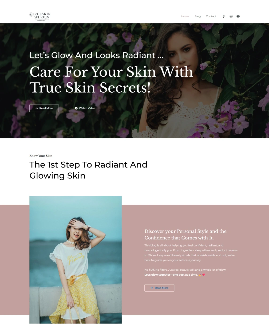
The beauty-site design uses a deep green photographic hero followed by a softer blush introduction. The change in background and content density separates the opening impression from the explanatory section. Navigation then provides routes to the blog and contact page.
This demonstrates page composition and a consistent visual direction. It also raises useful editorial questions: what should a reader understand about the site immediately, how should articles be grouped, and which action should follow the introduction? Answering those questions would help the homepage function as an editorial starting point rather than just a series of visual sections.
The broader supplied capture contains placeholder copy in later sections. A finished launch would therefore require an editorial completion pass, working destinations for calls to action and a review of any testimonial or expertise claims. The screenshot does not establish that those checks were completed.
I would keep the visual palette while clarifying the opening message, making article categories easier to find and replacing generic actions with destination-specific labels. Those are new editorial recommendations based on the sample. No improvement in traffic, engagement or conversions is claimed.
What connects the two examples
Both designs need their visual hierarchy to lead to a useful next step: property selection in one case and content discovery in the other. The source images show the design direction; the commentary identifies the decisions that would need validation before claiming a finished, effective product.
For WordPress work supported by historical performance and content evidence, view Klimastål. For smaller interface exercises, view UI explorations.