
Product UI explorations
These are small design exercises, grouped on one page because neither needs to be inflated into a standalone commercial case study. They explore how product imagery, information and controls compete for attention. The screenshots are static concepts; they do not demonstrate a working cart or tested conversion improvement.
E Glide Pro: organize the product decision
Scope: product-page design exercise. Anchor: e-glide-pro.
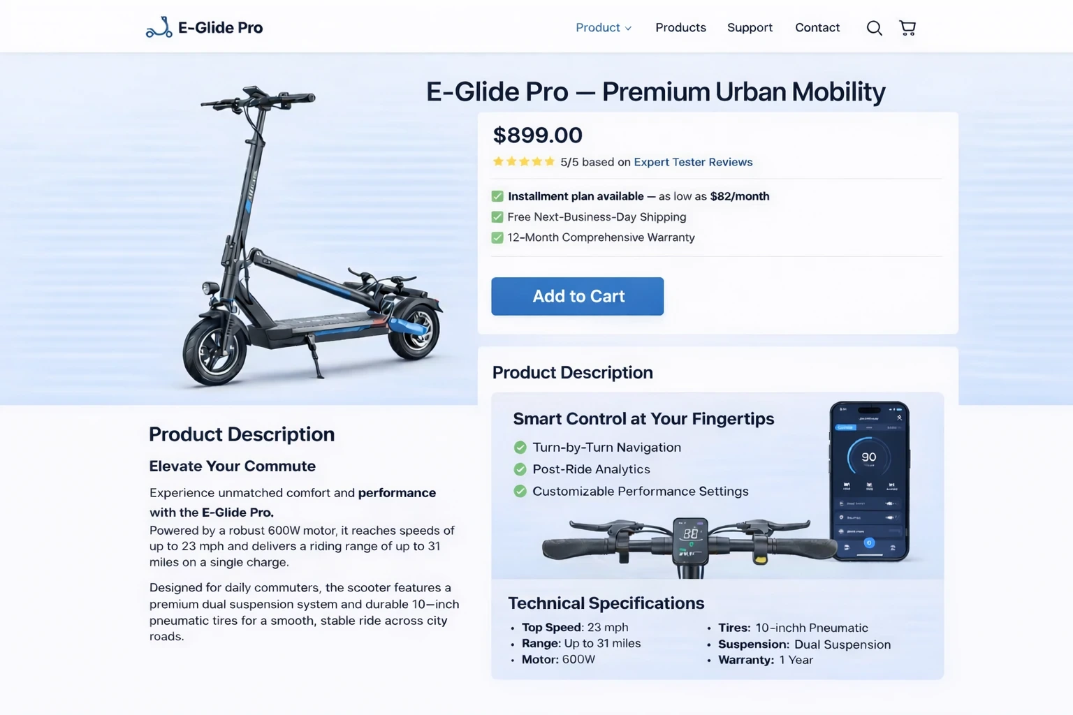
The scooter concept pairs a large product image with name, price and an action, then introduces product description and specification information. It gives a viewer both an initial product impression and the details needed to continue evaluating it.
The design question is prioritization. A product page needs to make the primary offer legible without forcing every specification into the hero. In a further iteration I would separate the few specifications most important to selection from the longer details, then check whether the purchase action remains visible and understandable at mobile widths.
The original price, product claims and review-related content are demonstration material. They are not independently verified product facts or evidence of a live store. Before implementation, the next step would be a real content model: product options, availability, delivery information, purchase constraints and the states the page must handle.
Clothing product UI: the image as the focal point
Scope: template-based interface prototype. Anchor: clothing-product-ui.
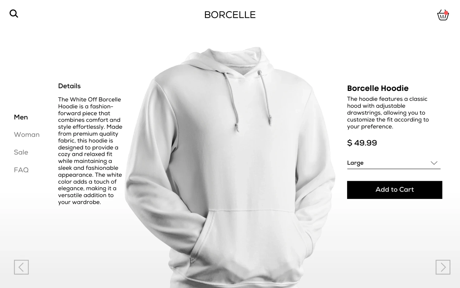
The clothing layout places the hoodie centrally, with descriptive copy to one side and purchase information to the other. The size selector sits directly above the add-to-cart action. This is a clear visual study of how a single product can anchor a page.
The screenshot alone cannot answer interaction questions. It does not show what happens when a size is unavailable, whether size guidance is accessible, how a product image can be inspected, or what feedback follows adding an item to the cart. Those are specific next design states, rather than reasons to invent a completed implementation.
| Next state to design | What it should communicate |
|---|---|
| No size selected | What the visitor needs to choose before proceeding |
| Unavailable size | Availability and any legitimate alternative action |
| Add-to-cart confirmation | Which item and option were added, with a route to review |
| Mobile layout | A readable sequence of imagery, details, selection and action |
This table is a new design brief derived from the visible prototype. It is not a usability test result. A follow-up study could document the completed states, explain the interaction decisions and evaluate them with users before making a performance claim.
Why these belong in a supporting collection
The exercises show visual composition and attention to product-page structure. They are relevant to my website skills, but they should not compete with the implemented SEO work at the top of the Work page. Grouping them preserves the breadth of the portfolio while keeping their scale and evidence clear.